https://chocchip.com.au/wp-content/uploads/2017/04/thumb-1.jpg
612
1088
dev
https://chocchip.com.au/wp-content/uploads/2017/03/logo-white-transparent.png
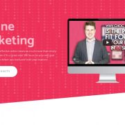
dev2017-04-25 13:02:182020-05-18 16:42:56Free Facebook Marketing Trick – Finding Your People
Choc Chip multimedia’s website design blog. This area is for lighter, more reflective pieces that might be thoughtful but don’t fit into one of the more serious article categories.
#1 Url – 15 Must Have Items For Your Small Business Website
So why isn’t your website doing as well as it should? Maybe your missing one of the 15 must have items every business website should feature!
Choc Chip Digital loves helping small businesses achieve success, so if your interested in learning more about how you can improve your online presence and raise your busiess profile why not get in touch with us.
www.chocchip.com.au
info@chocchip.com.au
03 5234 5360
https://chocchip.com.au/wp-content/uploads/2017/04/photography-thumb.jpg
738
1280
dev
https://chocchip.com.au/wp-content/uploads/2017/03/logo-white-transparent.png
dev2017-04-12 13:40:302020-05-18 16:42:56The Power Of Professional Photography For Your Website
https://chocchip.com.au/wp-content/uploads/2017/04/design.jpg
738
1280
dev
https://chocchip.com.au/wp-content/uploads/2017/03/logo-white-transparent.png
dev2017-04-10 10:28:542020-05-18 16:42:56The Power Of Design!


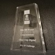
Choc Chip awarded – Elite 500 David Dugan Award
Recently Choc Chip Digital was awarded the Elite 500 David Gugan award for it’s recent efforts in the 10 X 10 challenge. This award highlights Choc Chips fantastic work in business best practices and entrepreneurial work within the local community.
We are excited about the future of Choc Chip Digital and have our eyes set on a bigger and better 2017, continuing to service the local Geelong and Surfcoast business community with powerful websites and online marking which makes an impact!
If you are have a tired outdated website that’s failing to achieve your business needs or you are looking to take your business to the next level get in contact with us here at Choc Chip Digital though our website, email or call us on 5234 5360 .

How to send emails that aren’t spam
Email is a cheap way to reach large numbers of people. We suggest that every business should have an email list that they send to regularly as part of their online marketing strategy.
But when does sending email become spam?
Spam is essentially unwanted email. If you make sure your readers are recieving quality content, know who you are and have the opportunity to unsubscribe if they want to, then there will rarely be any problems.
The Spam Act 2003
In Australia the Spam Act 2003 makes it illegal to contact anyone by email without their prior consent – which means that any email you send to someone without asking them first could be considered a breach if interpreted strictly.
The catch comes as the idea of inferred consent. For example, as a designer you may send your clients an email offering them a new product or a follow-up service, and because they’ve dealt with you before you have inferred consent to contact them again.
You also need to make sure that you properly identify yourself as the sender of the email. If you have proper attribution it will also build trust in the reader’s mind when they see that a real person
There are also rules relating to mailing lists or newsletters that say that readers must be able to unsubscribe by asking not to be contacted again. The opportunity to unsubscribe must be presented in each email you send someone.
Basically, if your business uses any form of e-marketing you must understand and meet the following three key requirements of the Spam Act:
- Consent – make sure you have consent to contact the recipient and can prove you have obtained it.
- Identify – include information to identify yourself as the authorised sender of the message.
- Unsubscribe – make sure your messages have a functional unsubscribe facility so that recipients can unsubscribe at any time.
These rules apply to not only email but SMS (text message), MMS (image based text messages) or instant messaging.
No-one wants to be a spammer, it’s bad for your reputation and your business. However, this doesn’t mean you have to leave email behind. If you follow these guidelines and use your common sense you can still use email as a powerful marketing tool to great success.
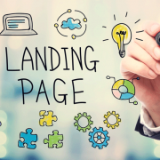
7 Steps To Effective Landing Page Design
If you have been online for long, you are likely familiar with “landing pages”. A landing page is a web page that prompts a visitor to take a single specific action. Such as subscribing to a newsletter, or signing up for a webinar. In this article, we’ll discuss how to make sure that more visitors take action on your landing pages.
Step 1 – Performance Optimisation
Performance is a topic that is too often neglected when discussing landing page optimisation. Most landing page tips focus on things that are only important AFTER the visitor has landed on the page. If a landing page takes to long to load, the on-page elements become irrelevant as few people ever see them. To avoid losing visitors before the page loads, make sure your landing page loads in less than 3 seconds. You can test landing page speeds by copy pasting the page URL into a free online tool such as GTMetrix.com.
Step 2 – Choose Your Colors
Color is one of the most important aspects of any web page. After all, it is the first thing that a visitor will notice. Be sure to use no more than 2-3 colors on your landing pages: A background color, a headline and bold text color, and a standard text color.
Background Color
Think of the background as the canvas upon which you will “paint” all your landing page elements. The last thing that you want is obnoxious colors that outshine everything else on the page. Instead, use colors like white, and soft shades of blue, green, brown, or black.
Headlines, Bold Text, & Call To Action Color
Headlines, bold text and calls to action require a different approach. You want your headlines, bold text, & bullet points to jump off the page. They should be the first thing that a visitor notices when they reach your landing page. Select a color that contrasts with your page background as much as possible.
Text Color
Your text should be easy to read, but you don’t want it competing with the other elements for attention. It’s usually a good idea to stick with some shade of grey for landing page text. The lighter the background, the darker the grey, and Vica Versa.
Step 3 – Writing For Conversions
The copy (text) is arguably the most important element on your landing page. However, this will depend on where your visitors are coming from. Organic traffic from search engines will need a lot of detail. A visitor who has clicked an ad will need less detail. This is because the ad creative will have already provided much of the information. The following elements can all be labeled as “copy”.
Headlines
If used properly, headlines can convince a visitor to take action on their own. Every headline should do the following;
- Make it clear WHAT your offer is.
- Make it clear HOW your offer will benefit the visitor.
The headline should do this as quickly and clearly as possible. Take the headline of this article for example.
7 STEPS TO EFFECTIVE LANDING PAGE DESIGN
It’s been broken into two essential parts:
7 STEPS…
This first part tells you HOW it’s going to help you. It’s going to give you 7 actionable steps that show you HOW to improve your landing page.
…TO EFFECTIVE LANDING PAGE DESIGN
This second part tells you WHAT you are going to get. You get a more effective landing page. Keep the headline simple and benefit driven and you will see your conversions increase.
Bold Text & Bullet Points
Bold text and bullet points highlight the features and benefits of your offer. They should be used sparingly throughout your text. These sections of text allow visitors to scan your page, without having to read every word. Yet they still provide a thorough understanding of your offer and what you want the visitor to do.
Text
The bulk of your text will go into more detail than most visitors will ever read. Most people will only read the headline and scan the highlights. That should be all they need to decide whether they want what you are offering. But for those people who want more information, you can go deeper into detail in the bulk of your text.
Step 4 – Proper Use Of Images or Video
Proper use of images is an important part of most landing pages, but images can be tricky… Often the image that you think will perform the best gives you the worst results. A commonly used image type that converts well is a personal image of you or your team wearing open, honest smiles. This attaches a face, or faces, to your brand that people then associate with your products. It’s easier for people to trust a smiling face than an anonymous web page.
If you decide to use a video on your landing page, the same principles apply as with images. Video however can be much more powerful. I will not go into a great amount of detail on the use of video on landing pages. There are entire YouTube channels and blogs dedicated to this already. If you are new to online marketing, I would recommend sticking with images. Only move to videos once you are ready to invest the time and money to get it right.
Step 5 – The Basics Of Buttons
Call to action buttons are usually complicated by marketers. In reality, they should be the simplest element on the page. A call to action button should:
- Contrast with all other page colors so that it pops off of the page,
- Have a clear call to action, (Ex. “Get Your FREE PDF Download Here”).
- Be featured above the fold* on the landing page, as well as near the middle and bottom.
By the time someone is looking at your call to action button they have already decided whether or not to click. Don’t overthink your buttons. Just make sure they are visible, clear, and functional.
* “Above the fold” refers to the section visible on a web page before the visitor scrolls down.
Step 6 – Two Step Optin Forms
If your landing pages goal is to capture visitor information for follow up. The best way to do that is with a two step optin form.
This means that:
- The first step of the page provides the information and call to action.
- The second step is a popup optin form or payment processor.
Always use two step optin forms. They are more effective than embedding your forms directly onto the landing page. They allow you to get the user to say “Yes” before requesting any information, which is a powerful psychological trigger.
Step 7 – Above The Fold
Finally, you want to ensure that all of the elements mentioned above are located above the fold. This area should contain:
- A Headline,
- An Image or Video,
- Bullet Point Features and Benefits,
- A Call To Action Button which links to an appropriate form.
The area below the fold can contain more information for those who want it.
Landing Pages In A Nutshell
Landing pages do not need to be complicated. Unfortunately, there is a lot of software on the market offering landing page templates. That means that to sell more templates, these software companies keep creating more. The more there are, the more complicated they get.
Keep it simple.
- Focus on the benefits that your product or service will provide to the visitor.
- Make it as easy as possible for them to get your product or service.
That’s it.