Choc Chip awarded – Elite 500 David Dugan Award

Recently Choc Chip Digital was awarded the Elite 500 David Gugan award for it’s recent efforts in the 10 X 10 challenge. This award highlights Choc Chips fantastic work in business best practices and entrepreneurial work within the local community.

We are excited about the future of Choc Chip Digital and have our eyes set on a bigger and better 2017, continuing to service the local Geelong and Surfcoast business community with powerful websites and online marking which makes an impact!

If you are have a tired outdated website that’s failing to achieve your business needs or you are looking to take your business to the next level get in contact with us here at Choc Chip Digital though our website, email or call us on 5234 5360 .

How to send emails that aren’t spam

Email is a cheap way to reach large numbers of people. We suggest that every business should have an email list that they send to regularly as part of their online marketing strategy.

But when does sending email become spam?

Spam is essentially unwanted email. If you make sure your readers are recieving quality content, know who you are and have the opportunity to unsubscribe if they want to, then there will rarely be any problems.

The Spam Act 2003

In Australia the Spam Act 2003 makes it illegal to contact anyone by email without their prior consent – which means that any email you send to someone without asking them first could be considered a breach if interpreted strictly.

The catch comes as the idea of inferred consent. For example, as a designer you may send your clients an email offering them a new product or a follow-up service, and because they’ve dealt with you before you have inferred consent to contact them again.

You also need to make sure that you properly identify yourself as the sender of the email. If you have proper attribution it will also build trust in the reader’s mind when they see that a real person

There are also rules relating to mailing lists or newsletters that say that readers must be able to unsubscribe by asking not to be contacted again. The opportunity to unsubscribe must be presented in each email you send someone.

Basically, if your business uses any form of e-marketing you must understand and meet the following three key requirements of the Spam Act:

  1. Consent – make sure you have consent to contact the recipient and can prove you have obtained it.
  2. Identify – include information to identify yourself as the authorised sender of the message.
  3. Unsubscribe – make sure your messages have a functional unsubscribe facility so that recipients can unsubscribe at any time.

These rules apply to not only email but SMS (text message), MMS (image based text messages) or instant messaging.

No-one wants to be a spammer, it’s bad for your reputation and your business. However, this doesn’t mean you have to leave email behind. If you follow these guidelines and use your common sense you can still use email as a powerful marketing tool to great success.

How Much Should I REALLY Pay for a Website?

When people contact us here at Choc Chip Digital for help with a blog or website, they have one main question.

How much is this going to cost?

It’s a logical thing to ask, really. Those of us who aren’t rich or famous have a finite amount of money, and we always want to feel like that money is being used in the smartest way possible. We are especially cautious when it comes to paying for something intangible like a website – you can’t hold it in your hand, so how much can it really be worth?

The cost of web design work varies wildly. You could ask for quotes from 10 different designers and receive 10 completely different dollar amounts, ranging from a few hundred dollars to several thousand. How do you decide what amount you’re willing to pay?

Factors That Affect the Price of Website Design

1. The components and features you need.

Never assume that your needs are “simple” or should be cheaper than a designer’s standard rate. Some things look easy but are very complicated, while others seem like a big deal but are very easy to implement. Your site may only consist of a single page, yet that doesn’t mean it’s automatically cheaper than one with 5 or even 100 pages.

The thing is, designers don’t always price by the amount of time something takes. Your doctor can stitch a cut in 10 minutes, but that doesn’t mean it doesn’t require knowledge, skill, and precision. Likewise, we have spent considerable time learning to do what we do. If anyone could do it, we wouldn’t have jobs. Adding things like forums, ecommerce, opt-ins, memberships, and other custom functionality is simply going to cost more money.

2. Your designer’s skill level.

Yes, you can get a website for $150. No, it won’t be the same quality as a website that costs $4500. It’s like the difference between a bicycle and a Lexus. Both will get you where you need to go, but one is decidedly better than the other. Designers who charge more are providing you with expertise you won’t find at a bargain rate – and in most cases, the benefits will definitely outweigh the added costs. If you automatically choose the cheapest option, you risk hiring a designer who sucks. Don’t say I didn’t warn you!

3. How demanding you are as a client.

Oops, I mentioned one of those things no one is supposed to talk about! But in the interest of being honest, (which we are all about here at Choc Chip Digital!) I’ll just tell you: If you email or call your designer 50 times a day, expect a billion tiny revisions, cut into their time with my family, and/or request things outside the scope of the working relationship, it’s going to cost you. Over time, designers learn how to sniff out “difficult” clients pretty easily, but if one sneaks through the gates, they are going to make absolutely sure we are compensated for the extra work. Please remember that designers are people and we (sometimes) have lives away from our computers.

So How Much Should I Pay?

Here are a few questions to ask yourself before deciding on a budget for website design.

FOR BLOGS:

What is the point of my blog? If you blog to share photos and memories with your family and don’t make any money from it, I wouldn’t spend more than a few hundred dollars for a design at the most. Actually I’d probably just grab a free theme and leave it at that. If, however, you make thousands of dollars a year from your blog and need it to do specific things for your visitors, it’s time to increase the budget.

What will I gain from a professional design? Whether you want to attract better advertisers or get featured on big name websites, a professionally designed blog will always outperform a generic one. If you knew that spending $3000 now would earn you 5-6 times that in the next year alone, wouldn’t it make sense to spend the money?

Should I outsource this? Many, many bloggers ask me for a quote, then tell me they’re going to design their own sites to save money. When that happens I usually see one of four results:

  • They waste hours and hours trying to figure out what to do, then the end result still looks awful.
  • They waste hours and hours trying to figure out what to do, then get frustrated and hire someone anyway.
  • They immediately go hire a cheaper designer, then end up hiring us to fix what the designer broke.
  • They pay for another design within a year of the DIY job because it wasn’t what they wanted.

In those situations, all I see is wasted time, money, and/or effort. If you’re a blogger, focus on blogging, especially if that’s how you earn your living. There’s no shame in outsourcing the things that aren’t a good use of your time.

WHAT YOU SHOULD SPEND: Anywhere from a few hundred to a few thousand dollars, depending on the value you would get from a better design. In general, I wouldn’t spend more than $5000 on a blog design unless you have a huge audience and very specialized needs.

FOR BUSINESS WEBSITES:

How important is it to have a website for my business? It’s the 21st century, and over 60% of internet users research products and services online before they make a purchase. If your company doesn’t have a website, regardless of what you do or how many employees you have, you are totally missing out. That said, having an ugly, outdated website isn’t going to help you much in the reputation department. It’s easy to tell yourself that any web presence is better than none, but you can certainly lose potential clients or customers if they perceive your brand as “cheap” or out of touch.

What does my website actually do for my business? Do people use your website to learn about what you offer? Make appointments? Purchase products? Find your phone number? Two important points about this: (1) If your website doesn’t lead to more business, that’s a problem. And it’s not because the web doesn’t work – it’s because your site doesn’t. (2) If your website does lead to more business, it’s time to ask yourself what could help improve conversion rates or make things easier for clients and customers.

What does my business really need? I’ve talked to business owners who are obsessed with things that simply don’t matter. They absolutely must have a menu that pops out a certain way, or they want to push content lower on the page just to make the logo bigger. And while they’re worrying about all those nitpicky details, they’re missing the fact that half their visitors never click beyond the homepage. If you aren’t sure what your business site needs, it’s time to consult with someone who does. Immediately.

WHAT YOU SHOULD SPEND: Website designs for businesses are more difficult to price because there are so many factors involved. I would say you should always expect at least several thousand dollars, if not much more than that. Don’t like that answer? Try thinking of your website as an employee  and I think you’ll see why you’re getting a bargain no matter what you spend.

As always if you’re a Geelong small business and want to know more about the team here at Choc Chip Digital, this article or want to contact us directly to develop your website visit our contact us page or contact us directly at info@chocchip.com.au or 03 5243 9817

7 Steps To Effective Landing Page Design

If you have been online for long, you are likely familiar with “landing pages”A landing page is a web page that prompts a visitor to take a single specific action.  Such as subscribing to a newsletter, or signing up for a webinar. In this article, we’ll discuss how to make sure that more visitors take action on your landing pages.


Step 1 – Performance Optimisation

Performance is a topic that is too often neglected when discussing landing page optimisation. Most landing page tips focus on things that are only important AFTER the visitor has landed on the page. If a landing page takes to long to load, the on-page elements become irrelevant as few people ever see them. To avoid losing visitors before the page loads, make sure your landing page loads in less than 3 secondsYou can test landing page speeds by copy pasting the page URL into a free online tool such as GTMetrix.com.


Step 2 – Choose Your Colors

Color is one of the most important aspects of any web page.  After all, it is the first thing that a visitor will notice. Be sure to use no more than 2-3 colors on your landing pages: A background color, a headline and bold text color, and a standard text color.


Background Color

Think of the background as the canvas upon which you will “paint” all your landing page elements. The last thing that you want is obnoxious colors that outshine everything else on the page. Instead, use colors like white, and soft shades of blue, green, brown, or black.


Headlines, Bold Text, & Call To Action Color

Headlines, bold text and calls to action require a different approach. You want your headlines, bold text, & bullet points to jump off the page.  They should be the first thing that a visitor notices when they reach your landing page. Select a color that contrasts with your page background as much as possible.


Text Color

Your text should be easy to read, but you don’t want it competing with the other elements for attention. It’s usually a good idea to stick with some shade of grey for landing page text.  The lighter the background, the darker the grey, and Vica Versa.


Step 3 – Writing For Conversions

The copy (text) is arguably the most important element on your landing page. However, this will depend on where your visitors are coming from. Organic traffic from search engines will need a lot of detail.  A visitor who has clicked an ad will need less detail.  This is because the ad creative will have already provided much of the information. The following elements can all be labeled as “copy”.


Headlines

If used properly, headlines can convince a visitor to take action on their own. Every headline should do the following;

  • Make it clear WHAT your offer is.
  • Make it clear HOW your offer will benefit the visitor.

The headline should do this as quickly and clearly as possible. Take the headline of this article for example.

7 STEPS TO EFFECTIVE LANDING PAGE DESIGN

It’s been broken into two essential parts:


7 STEPS…

This first part tells you HOW it’s going to help you.  It’s going to give you 7 actionable steps that show you HOW to improve your landing page.

…TO EFFECTIVE LANDING PAGE DESIGN

This second part tells you WHAT you are going to get.  You get a more effective landing page. Keep the headline simple and benefit driven and you will see your conversions increase.


Bold Text & Bullet Points

Bold text and bullet points highlight the features and benefits of your offer.  They should be used sparingly throughout your text. These sections of text allow visitors to scan your page, without having to read every word.  Yet they still provide a thorough understanding of your offer and what you want the visitor to do.


Text

The bulk of your text will go into more detail than most visitors will ever read. Most people will only read the headline and scan the highlights.  That should be all they need to decide whether they want what you are offering. But for those people who want more information, you can go deeper into detail in the bulk of your text.


Step 4 – Proper Use Of Images or Video

Proper use of images is an important part of most landing pages, but images can be tricky… Often the image that you think will perform the best gives you the worst results. A commonly used image type that converts well is a personal image of you or your team wearing open, honest smiles. This attaches a face, or faces, to your brand that people then associate with your products.  It’s easier for people to trust a smiling face than an anonymous web page. 

If you decide to use a video on your landing page, the same principles apply as with images.  Video however can be much more powerful. I will not go into a great amount of detail on the use of video on landing pages.  There are entire YouTube channels and blogs dedicated to this already. If you are new to online marketing, I would recommend sticking with images.  Only move to videos once you are ready to invest the time and money to get it right.


Step 5 – The Basics Of Buttons

Call to action buttons are usually complicated by marketers.  In reality, they should be the simplest element on the page. A call to action button should:

  • Contrast with all other page colors so that it pops off of the page,
  • Have a clear call to action, (Ex. “Get Your FREE PDF Download Here”).
  • Be featured above the fold* on the landing page, as well as near the middle and bottom.

By the time someone is looking at your call to action button they have already decided whether or not to click. Don’t overthink your buttons.  Just make sure they are visible, clear, and functional.

* “Above the fold” refers to the section visible on a web page before the visitor scrolls down.


Step 6 – Two Step Optin Forms

If your landing pages goal is to capture visitor information for follow up. The best way to do that is with a two step optin form.

This means that:

  • The first step of the page provides the information and call to action.
  • The second step is a popup optin form or payment processor.

Always use two step optin forms.  They are more effective than embedding your forms directly onto the landing page.  They allow you to get the user to say “Yes” before requesting any information, which is a powerful psychological trigger.


Step 7 – Above The Fold

Finally, you want to ensure that all of the elements mentioned above are located above the fold. This area should contain:

  • A Headline,
  • An Image or Video,
  • Bullet Point Features and Benefits,
  • A Call To Action Button which links to an appropriate form.

The area below the fold can contain more information for those who want it.


Landing Pages In A Nutshell

Landing pages do not need to be complicated. Unfortunately, there is a lot of software on the market offering landing page templates.  That means that to sell more templates, these software companies keep creating more.  The more there are, the more complicated they get.  

Keep it simple.

  1. Focus on the benefits that your product or service will provide to the visitor.
  2. Make it as easy as possible for them to get your product or service.

That’s it.


Top UX Trends 2016

Top 10 UX Trends In 2016

If you’ve been using the internet long enough, you’re probably able to look back and see some of the shifts and trends that have happened over the years.

These shifts in web design happen because the market evolves, requiring new technology, better usability, and more importantly, designers are stepping up their game and keeping each other on their toes.

As more and more clever designers start tapping into the new technologies becoming available to them, the trends will continue shifting. The only way to keep up with the pack is to be able to spot them, and then learn how to implement the changes into your own designs.

This article will cover some of the shifts in design that we’ve seen over the last year, and where we think things are going to be heading into 2016, 2017, and beyond.  If you want to stay relevant as a web designer, you need to not only keep up with the changing landscape, but also be able to easily adapt, and develop the right mindset to spot potential shifts into the future, as well.

Photoshop is making it’s way out, along with image heavy designs.

When designers figured out that they could create a blocked design that could then be layered with high quality photoshop images, the internet changed in a big way.  Long gone were the days of static HTML pages, boring table layouts, and endless scrolling to see the entire page.

However, as increased numbers of designers jumped on board with CSS based layouts, and layering images to the backgrounds of their layout, site speed began to slow to a crawl.  

Around this time, internet bandwidth and speeds began to go up, so the image heavy designs weren’t nearly as noticeable.  The static HTML sites, during this time period, would load lightning fast.

These days, though, with more people browsing the internet on their mobile devices, history is beginning to repeat itself.  

Slower bandwidth, and image heavy designs are working to keep the users from actually visiting the site – instead, hitting the back button and looking for another site that loads quickly.

Most times, too, image heavy designs cannot load properly on smaller touch screen devices.  This leaves images looking chopped up, layouts broken, and the user wondering where they should be clicking.

There is no generally accepted standard, so take your mobile visitors into account, and start creating designs that do away with the heavy, slow loading images, in favor of a CSS heavier design that loads much quicker, provides additional effects, and is compatible with most of the touch and mobile devices available today.

Designing around time spent onsite.

Web user’s attention spans are not getting any longer.  In fact, when a visitor lands on your website, you’ve got mere milliseconds to grab their attention before they’re distracted and thinking about other things again.  

That means, if your website takes forever to load (because of heavy images, hint, hint), you’re putting yourself at a disadvantage before you ever get the chance to convert that visitor into a new customer.

When you manage to get the site loading quickly, and have captured enough of the visitor’s attention to keep them browsing around, it’s time to figure out what they’re doing on your site, the paths they’re traveling through, and how long they’re spending on each page.

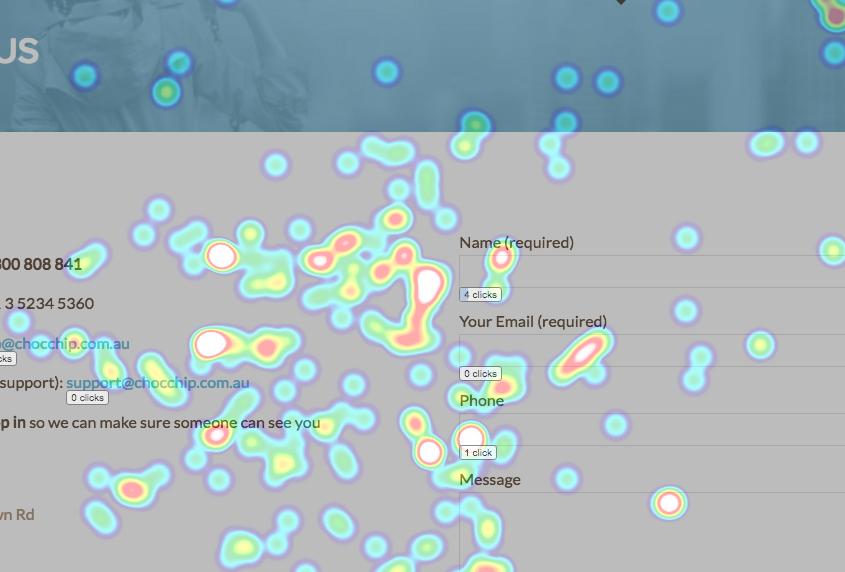
By using click trackers and heat maps, you’ll be amazed at what really goes on behind the scenes, when a visitor is working their way through your site.  Take this data and start working to get your most critical content into the “hot” positions on your pages, and watch your overall conversion rates increase.

Website Heat Map

Content is the new architecture.

Websites got away with using landing pages alone, in years past.  From their homepages, to the pages used to showcase their products and services, designers figured out that bare minimum content was enough to get by.  The internet is evolving again, though.

Revisiting a user’s attention span, it takes more content these days to get a visitor interested in what you’re offering, where, before, you could simply get a landing page with a couple hundred words of compelling copywriting to convert them into a sale.

Blogging is taking over in 2016, even for large corporations.  Businesses of all sizes are realizing the benefits of providing longer, more engaging content to their readers, and are relying on enticing headlines to get the visitors to stop clicking around on their favorite sites, and get them to move over to their own website.

Long Form Blog Content

Think about the advertisements that you see these days.  When was the last time you saw an ad that took the user straight to a product’s landing page, and then only contained 100-200 words of copywriting?  Chances are, not that many.

Nowadays, you need to work on funneling the visitor through longer content that gets their mind off of being sold to, and then use the same content to funnel the visitors onto your sales page.  If the visitor gets a hint of being sold, they’re going to hit the back button, or go back to what they were doing before they landed on your site in the first place.

Touch first designs are becoming more popular.

You probably already know (or at least, should know) that responsive designs are a requirement in 2016.  You can’t just get away with having a desktop version and a separate mobile version of your site.  They need to be one, in the same.

Likewise, even desktops and laptops are following suit with mobile devices, and becoming touch screen.  As the internet’s population gets lazier, and lazier, you’re going to have to work harder, and harder to keep their attention focused on your site.

One great way to do that is by implementing those touch focused design elements into your layouts across the board.  

There are really no downsides to having flat buttons and other elements that come natural to touch users, because desktop users can still click a mouse and the same urge to click carries over from their mobile devices.

In other words, the same types of designs and layouts that work great for smartphones and tablets also work great for desktops — even as they become more touch focused.  If your website is easy to browse around on using a small screened smartphone, it’s going to be just as easy to navigate on a desktop computer.

That means you can write off creating designs solely for desktop computers, instead focusing on smaller screens, and then include responsive elements that also look good when they’re scaled up on a desktop computer.

Incorporating customer data to increase user experience.

Implementing heat maps into your custom designs is something that you should already be doing, and something that large advertising agencies picked up on long ago.  The heatmaps and click tracking that were mentioned previously in this article are precisely the type of information that you need to be tracking.

Instead of using it to test the efficacy of your advertising, though, you need to use them to figure out what visitors are doing on the internet, when they land onto a site, so that you can begin creating designs that are focused on getting the most important functionality into these “hot spots”.

On a separate not, it can also tell you where you are potentially losing out on visitors.  For instance, if you implement the tracking and notice that visitors are scrolling halfway through the page, you can begin to address any issues that may be happening around that area.  

Most times, changing up the page copy, adding in the next step for your visitor, or even figuring out what the next logical step for them may be will not only increase their usability, but also increase the amount of conversions you’re able to make on the same design — without feeling left in the dark about where visitors are dropping off.

Large brands and advertising agencies have used heat maps and click tracking for years.  Now, designers are finally starting to figure out the power of the technology, and using it to help them create better designs that focus more on usability and functionality and, more importantly, reducing your bounce rate, rather than just looking good.

Card layouts, Hero images, and Rich animations.

We’ve already told you that getting your visitor’s attention while they’re on a mobile device is next to impossible these days, but there are a few design elements that you can implement to help you make sure they don’t hit the back button too quickly.

Card layouts, “hero” images, and rich animations all help keep your visitor’s attention, while not weighing down your site too much, or causing it to load slowly.

Card layouts are designs like Netflix and Pinterest use.  They lay out multiple cards for visitors to browse through, and continually load more as the user scrolls further, and further down the page. These cards are also database driven (in most cases) and are designed to load more cards that are similar to what the user has already clicked, and prefers to see.  

Think about your Netflix dashboard and how they automatically deliver shows and movies that are related to the shows and movies you’ve previously watched.  That means, as a designer, it’s time to start learning how to control the database to start displaying the most relevant content to your visitors, based on their past browsing patterns.

“Hero” images are the large images that take up the entire section “above the fold” and depict the company, brand, or website in a shining light.  For example, check out the image below by Tatabrew (http://tatabrew.com/).  It displays the company’s image front and center, and requires that you scroll down to get to the actual content.  This has a huge impact on grabbing your visitor’s attention as quickly as possible.

Tatamagouch-Brewing-Co-Hero-Image

The last design element that can get your user to stop what they’re doing and take notice are rich animations.  Much like a hero image, these animations occur when a user clicks on something, or runs their mouse over an element in your design.  

Most commonly, rich animations are used to bring in pop under forms that allow the users to subscribe via email. They’re also commonly used in navigation menus, background images, and slideshows.

Getting micro-commitments and interactions from the user.

In the age of mobile, getting your visitors to make “micro-commitments” to your website is the first step in getting them to convert into a subscriber, or a larger financial transaction down the road.  

Funneling visitors down the path you want to take them is becoming more critical, and requires a bit more creativity than simply stating “click here”.

Nowadays, you have to use the headlines in your content, and then expand on the headlines with extensive content marketing to ensure that visitors are going where you want them to, when you want them to.  

In times past, this was left up to the copywriters, but it is falling more and more on the designers desk to get the visitors taking smaller steps that add up to a bigger “yes” down the road.

As the visuals and layout of the design are being pulled up on smaller screens, the actual real estate available to work with is quickly diminishing.  

That means you’ve got to prioritize the design elements that you want to showcase at the top of the screen, and then move further down into the less-than-priority elements as the user scrolls.  

Getting this right requires a fine balance between design and content still, but going into the future it’s going to fall more on the designer’s hands to get this area right so that the copywriter has a good platform to start working with.

Flat, responsive designs are here to stay.

3D images and highlight text look great on desktop devices, but with the wide array of mobile devices available, it’s practically impossible to optimize your design for every single screen.  

That means designers can finally get away with being lazy, and implementing more “flat” elements into their templates.  It also means that the newer templates will continue to load faster, and faster, and remain compatible as new devices with varying screen sizes continue to roll out.

Designers realized the quick loading, flat, responsive designs are a hit with mobile users.  Taking it one step further, “parallax” scrolling has made it even easier to keep lengthy pages loading as fast as possible.

Unfamiliar with what “parallax” scrolling actually is?  Take a look at this link on fracking.  They are a prime example of how to properly pull off the infinite scroll, and combine it with the rich animations mentioned above.

Now, the design we just linked to is a pretty in-depth example of what flat designs are (no 3D images) coupled with parallax scrolling, so even if your skills aren’t quite to that level, it gives you a bar that’s just been set that you should start working towards.

Customer research and feedback plays a bigger role than ever.

When was the last time you got live feedback from actual users of the designs you’ve implemented?  

If you’re like most other designers, you slap together a bunch of code, make sure it works across multiple devices, that the code is clean, and then you set it up on a server for your client to take control.

This is a huge mistake, though, because real world usage research and feedback from visitors that are going to be navigating around the site on a regular basis is critical to not only make sure what you’re building actually works, but helping you learn and grow as a designer into the future.

Designers and clients aren’t the users of sites, so a truly functional design requires customer input and the use of tracking data to properly pull off.  Big brands do it, so why aren’t you?

The next time you’re putting a design together for a client, send some traffic to it and install a live chat box in the lower corner that pops up as a user scrolls.  Ask them directly for feedback on the usability of the site, and what they think could be improved.

Keep in mind, though, these are customers — not your fellow designers.  

You’re going to get all sorts of off-the-wall answers, but every now and then you will find a diamond in the rough that gives you a solid avenue to approach, in terms of improving the design, functionality, and usability.

It will also get you in the head of the visitors who use your designs every day, and get you out of the designer state of mind.

Branding and typography are more important than ever.

With flat designs allowing less design elements to help stand out, the overall branding strategy and typography are becoming more important.  Building a memorable design that’s still functional is a hurdle designers are trying to overcome in 2016.

Your branding includes quite a few different aspects, and is going to vary from client to client, and design to design.  

The colors that the client chooses, the type and style of logo they display front and center, the typography chosen, whether there are videos on the page, or if it’s a page selling products, everything pulls together to give the user an overall experience.

Taking it one step further, this branding experience is going to have to work with multiple different platforms, from social media, to display ads, and email marketing.  

That means it’s even tougher for you, as a designer, to give a consistent look and feel that’s going to work for your clients, for their customers, and be compatible on various platforms — not to mention devices.

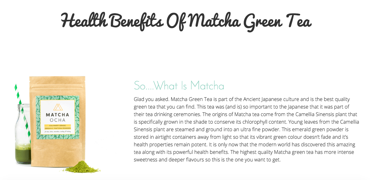
Typography In Web Design

Source: Matcha Ocha

How to stay ahead of the design curve going into 2016, and beyond.

Some trends have come and gone, while others are going to be around for years to come.  If you want to step up your game as a designer, here’s the areas you need to be focusing on going into 2016:

  • Photoshop and image heavy designs are becoming a thing of the past.
  • Figure out how your visitors are spending their time on the site, then design around it.
  • Keep your content front, and center, and use it to funnel visitors where you want them to go.
  • Think about your touch-enabled visitors, because they’re becoming priority #1.
  • Incorporate customer feedback and research into your designs to increase user experience.
  • Use database driven card layouts, hero images, and rich animations to grab the visitor’s attention.
  • Get “micro-commitments” from your visitors to lead them closer to a sale down the road.
  • Flat, responsive designs aren’t going anywhere, anytime soon.
  • Both customer, and client feedback will help you grow as a designer going into 2016.
  • Branding and typography are more important than ever, and need to remain consistent.

If you’re ignoring any of these areas, you’re going to get left behind by the competition and the big brands who are spending millions of dollars every year on developing their websites.

How To Bring Customers Into Your New Website

You’ve got an amazing new design that’s built to rank in the search engines, your branding is taken care of, and your social media profiles are setup, so what now?

Now, you start driving traffic to your site so you can get to business!  

Without having a solid digital marketing strategy in place, though, you’re going to be left wondering what to do next, and typically end up wasting your time (and possibly money).

Long gone are the days where you can rely on traditional marketing methods alone to get traffic coming into your business.  

These days, you can spend as little as a couple of hours a day working on your digital marketing strategy, and funnel more visitors into your website than you probably ever dreamed possible.

This article will help you fast track your way to seeing the traffic on your site start going upwards, and your monthly revenue increasing on a consistent basis. 

Included below is a finely tuned, 7 step strategy designed to help you get your newly built website started off on the right track:

Step #1: Make sure your pages are optimised for the search engines.

Step #2: Get your social media taken care of, then utilise it.

Step #3: Setup paid advertising campaigns, then track and analyze the results.

Step #4: Find sites willing to let you to buy banner or native advertising.

Step #5: Create a direct mail campaign targeted to your local clientele.

Step #6: Get creative, and then let the media know about it.

Step #7: Create listings on Craigslist that are targeted to your offer.

Search engine optimization is priority #1.

Every day, customers are searching for businesses just like yours.  Except, right now, they are probably finding your competition.

When you’re ranking in the top of the search results, the leads and customers are going to come to your website on autopilot.

While it does cost money to get to the top, once you’re there, the strategy begins paying for itself — often, multiple times over, month after month.  

The amount of leads you can generate from high placement in the search engines more than pays for the cost of getting there, as long as you’re doing it right.

The first step to ranking higher in the search results is to optimize each page on your site for a specific keyword.  Every page should have it’s own keyword to target, to ensure you’re casting the widest net possible, and have the highest chances of completely taking over your market.

To get started, visit Google’s Adwords Keyword Planner.  Enter in a few basic keywords that you think customers would use to find your site, and the Keyword Planner will return a list of other keywords that they deem relevant to your business.

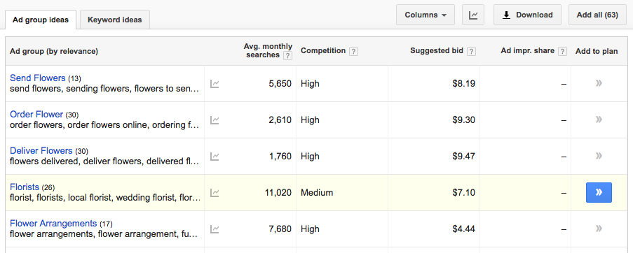
Screen Shot 2016-05-31 at 10.12.12 am

Screen Shot 2016-05-31 at 10.12.21 am

You can also input your website’s address and have Google generate ideas based off of the content that’s already on your pages, waiting to be optimised to rank.  Then, all you have to do is go through each page and optimise them so that the keyword appears in the right places.

Google’s generally accepted best practices dictate where you should be placing the keywords in your code and content.  The most effective locations on your pages are in the following areas:

  • Title tag.
  • H1, H2, and H3 tags.
  • Within the first few sentences.
  • Within the last few sentences.
  • Inside of the “alt” text in an image on the page.
  • Internal links pointing to the page on the rest of your site.

Now, keep in mind.  It’s easy to over-optimise your site.  By placing the keyword into the content too often, you could end up getting the page penalised, effectively keeping it from ranking on the first page.

If you notice that your pages seem to be stuck on the 2nd page of the search results and won’t move any higher, go back through the content and de-optimise it. Remove a keyword, or two in the content, or the internal links, and then analyze the results after a few weeks.  

De-optimizing the pages is often enough to move them into the first page of the search results.  This sounds counter-intuitive, but actively checking for over-optimised pages is a strategy Google uses to keep the spammers from being able to actively game the system.

Social media isn’t going to get any smaller, and requires a unique approach.

Social media platforms, such as Facebook, Twitter, Instagram, and Pinterest tend to get a bad wrap, as far as obtaining new customers goes, but we’re here to tell you that, with the right approach, you can tap into the millions of active visitors that spend their days on these sites.

Each platform has a different strategy that you need to use to get the most traction from it.  

Here’s a breakdown of the types of visitors you’re going to approach while you’re on each site:

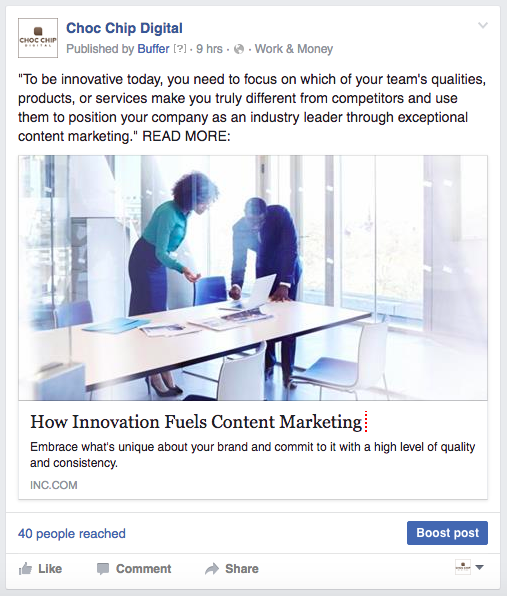
Facebook: Facebook is a treasure trove for reaching the masses as quickly as possible.  To get started, make sure that the content you’re going to be sharing is worthy of getting clicked, and then create a fan page surrounding your business.  

Once your page is complete, you can either pay Facebook to “boost” it for you, or you can join groups related to your business and promote the content yourself, for free.
Screen Shot 2016-05-31 at 10.19.08 am

Twitter: Twitter is great for getting in touch with bloggers and other business owners that already have a substantial following.  

Instead of simply promoting your content, business, products, and services, spend your time on Twitter connecting with the people who will have the biggest impact on moving their own subscriber base towards your website.

A lot of bloggers and marketers hang out on Twitter, giving you the perfect opportunity to tap into ready made audiences looking for businesses just like yours.

Instagram: Instagram is quickly rising as one of the superpowers in social media.  

If you run a visually based business, and can provide photos of the products or services you offer, get on board as quickly as you can.  Use hash tags, and find the influencers who have the largest following, then work on getting your message in front of them.

Pinterest: If your target market is women, Pinterest is a gold mine for you.  However, even if your target market is  primarily men, you can still create content geared towards women that will get them to either make a purchase for the man in their life, or get the man in their life interested in your business.

Paid advertising on platforms outside of Google’s Adwords are becoming more important.

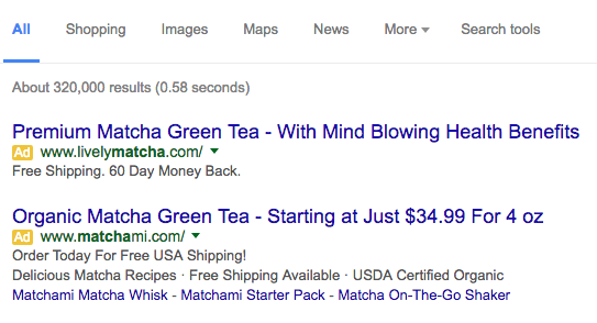
There’s no denying that Google’s Adwords advertising program is one of the best ways to instantly tap into your target market. However, in the past few years, it’s gotten incredibly expensive to advertise.

The expense of posting your ads to the top of Google’s search results pages means that you not only need to have a well designed website, and a solid sales funnel backed by proven data, but that you also need to track, analyze, and optimise every single advertisement you’re spending money on.

Advertising in Adwords gives you both instant brand recognition, as well as direct sales, but there are other platforms that can give you nearly the same results, without the heavy expenditures . 
Screen Shot 2016-05-31 at 10.23.54 am

If you have a properly built sales funnel, and are already spending on Adwords, or realised how expensive it can be, here are some cheaper alternatives you can use that will deliver the same instant results that Google does.  You can use the cheaper sources of traffic to test your campaign and then transfer it to AdWords.

Bing Ads: Bing Ads works exactly like Adwords does.  You choose the keywords that you want to bid on, and then when users enter those keywords into the search engines.

AdRoll: AdRoll keeps track of the visitors who have already come to your website, and then inserts a “cookie” onto their computer that follows them around the internet.  

Anytime an advertisement is displayed that AdRoll has control over, your ads will be put in front of the user again, and again.  This works great for keeping your products or services fresh in the customer’s mind.

7Search: 7search is great for mobile traffic.  If you know that your potential customers may be browsing around on their mobile devices, and you can entice them to visit through to your mobile optimised or responsive website, it’s a great source of traffic.  

The rates on 7search are highly affordable, making it easy to test your ad copy without blowing through your entire advertising budget in one day.

Outbrain: Outbrain places your ads directly underneath the content on large, authoritative sites, and blends your ads in with other “related posts” that users may already be inclined to click on.
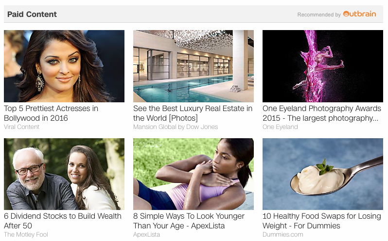
That means your click-through rate is going to be through the roof.  However, it also requires that you have a solid content marketing strategy in place, in order to convert these leads into sales.

Display advertising on sites in your market is an affordable solution.

If you’re advertising through Outbrain, you’re already going to be familiar with display advertising.  

If you’re not, what display advertising means is to buy banner spots on sites that are related to your business, or sites where your potential customers spend their time.

A lot of sites will allow you to place advertisements, for a small fee.  Placing your banner advertisements, or even advertorials (in some cases) on these sites has two distinct benefits.

First, you’re going to tap into an existing audience and start funneling them over to your own business website.  Second, you’re going to be gaining authoritative links from sites that are related to your own, which helps increase your rankings in the search engines.

To get started finding sites that allow you to place ads, go through the search results using the following queries.  

  • Your niche “advertise with us”
  • Your niche “sponsored post”
  • Your niche “sponsor a post”
  • Your niche “advertise on this site”

Remember to replace “your niche” with the topics that are relevant to your business.  For instance, if your website is based around travel products or services, replace “your niche” with “travel” and other related keywords.

When you find sites that allow you to place an advertisement, reach out to them with an offer.  In most cases, you can get away with sponsoring a post for a one time fee of $50 to $200, depending on the size of the site you’re attempting to advertise on, and the size of their existing audience.

If you’re local focused, don’t rule out direct mail. EDDM mail is effective still.

The United States Postal Service has been feeling the crunch during tough economic times.  

To help stay profitable and competitive, they’ve opened the doors to what’s known as “Every Door Direct Mail”.  It’s a program that allows you to get your advertisements into mailboxes in your local area for much less than what you would normally pay for postage.

To get started, you’re going to have to figure out a list of the zip codes that you want to target with your advertising.  Then, you’ll have to put together a brochure that will be sent to generalised “Postal Customers”.  

You will need to include a certain type of labeling on your mailers, so before you actually have the brochures or mailers printed, make sure to read through this guide, directly from the USPS: https://www.usps.com/business/pdf/quick-reference-guide.pdf

Once you have these two completed, reach out to your local post office.  Let them know that you are interested in the EDDM program, and that you already have the mailers ready to go.  They will ask you how many mailers, and which zip codes you want them to go to.  

After dropping off your mailers with them, it will take 2-3 weeks for full delivery to be finalised.  During this time, your incoming leads will continue to rise, until they peak towards the end of the mailing.

Get the media talking, and watch your traffic start climbing rapidly.

Think you have what it takes to “go viral”?  

If you have a bit of creativity, or happen to know someone who does, you can get your business in front of the local media outlets and create a story that takes off on social media like a wildfire.  

Even something as small as sponsoring a local cub scouts pack, or hosting a charity event for senior citizens in your small town is enough to get the media talking about your business — putting you in front of thousands of people.

Before you set out to make your business the next big headline in the local news, though, you need to sit down and think about a proper strategy, how you’re going to pull it off, and any potential backlash that may come from it as a result.

A lot of times, going viral can leave your business without the manpower available to handle the amount of inquiries and orders coming in, which can, in turn, create a customer service nightmare for you.  This would have the internet talking about how bad your customer service is, instead of speaking your praises from the rooftops.

When you have your campaign together, you can either reach out to local media stations to let them know about what you’re doing, or hire a “press release” service that will spread your message across the internet for you.  Once you have the message in place, you can give it a bit of help by “boosting” the post on Facebook.

Craigslist is still a viable solution to driving hot, ready to buy traffic to your site.

When you think of Craigslist, what pops into your mind?  

Most times, it’s going to be listing free stuff on the curb for someone in your area to come pick up.  Or, perhaps, even trying to find a car or truck for sale in your local area.  

Maybe even some of the less than savory sections of the site, if you’ve read about a few of the recent horror stories Craigslist has been putting out.

It’s these horror stories that have given rise to the massive amounts of negativity surrounding Craigslist.  However, if you’re able to get past them, though, there is still a large, active market of hot, ready to buy leads that you can funnel into your website.

To get started, browse to the sections of Craigslist that pertain to your products or services.  

Then, craft a targeted message, and come up with a specific offer that’s exclusive to Craigslist users, post your listing in the proper area, and wait for the calls and emails to start coming in.

You want to make sure that you’re not spamming, though.  

You also need to make sure that you’re actively monitoring your listings, because competitors will, sometimes, flag the advertisements as spam and Craigslist will automatically remove them without doing any further investigation.

The platform can be cut-throat at times, but it is still a viable choice for delivering hot leads that are looking specifically for what you have to offer.  If you get the right offer in front of them, and make sure that your listing stays active, it’s a huge source of free leads.

Now, it’s time for you to start implementing each strategy.

Each step that we’ve just laid out for you requires a unique approach in order to get the most traction.  That means you can’t just take a blanket approach and hope for the best.  You’ve got to go into each with a precise plan of attack to keep from wasting time and money.

To sum up the overall strategy provided, here is a list of quick tips to help you get the most out of each piece of the puzzle.

Search Engine Optimization

Build a list of keywords that are specific to the products and services you offer, and your local area (if you’re promoting to local clientele).  Then, optimise each page of your website to include these keywords, making sure not to over-optimise and potentially get your pages penalised. Search Engine Optimization is a complex topic, so sometimes its best to hire an SEO expert that can help you obtain the results you are after.

Social Media Marketing

Develop your social profiles on each of the four major platforms: Facebook, Twitter, Instagram, and Pinterest.  Then, use Facebook to reach critical mass by “boosting” your content, and Twitter to get in front of influential people who have a target audience similar to the type of customers you want to bring into your business.

Next, jump on Instagram and start getting visual with your products and services.  Post pictures, and find hash tags that are related to your business, then start promoting your content.  

Finally, get on Pinterest and create “boards” that contain your “pins” and help female based audiences either purchase your products and services, or recommend them to the men in their life.

Pay Per Click Advertising

To instantly place your website at the top of the search engine’s results pages, consider placing advertisements on major platforms such as Bing Ads, AdRoll, Outbrain, and 7Search.  

You can use the same keyword lists that you generated when you began the search engine optimisation of your website.

Native Advertising

To gain high quality links pointing to your website that will help increase your organic search rankings, as well as send targeted, qualified traffic to your website, reach out to other websites that are related to your own, and have a target audience that looks similar to the types of customers you’re marketing to.  

Contact the webmasters by using the search queries we’ve provided, and request placement of “native” or “banner advertising”.  Remember that a one-off fee is always preferred to a monthly cost for placement.

Every Door Direct Mail

Getting into your customer’s mailbox is easy with the United States Postal Service’s Every Door Direct Mail (EDDM) program.  Put together a brochure, flyer, or mailing piece that contains a message specific to your audience, with an offer that they can’t refuse.  Then have the flyers designed and printed with the proper labeling, and drop them off with your local Post Office.

Press Releases

Get the media talking about a small campaign, fundraiser, or charitable event that you’re running for your local area.  Spend time making sure that you’re able to handle the new influx of business, and that your marketing campaign is going to shine a good light on your company.  

Then reach out to a press release service, or your local media offices and journalists to let them know about what you’re doing.

Craigslist Leads

Craigslist, even having a bad rap, still provides businesses just like yours with a huge source of fresh leads that are ready to buy.  

If you position your products and services in the right categories, monitor your listings to ensure they stay alive and don’t get flagged as spam, and give the users of the site an offer that they can’t refuse, your business will tap Craigslist power to generate new customers.

Use the strategies we’ve laid out for you to start seeing leads coming into your website every day.

How to Nail Your Branding Like Boss

What makes a good boss anyway? In a word: delegation.  An effective boss can’t do it all, but does have a vision on how it can be done by all in a cohesive way. How does the vision for your brand fit into these crucial components of successful branding? You don’t have to reinvent the wheel, but make sure each of these spokes are strong to keep the gears turning towards success.

If your brand isn’t garnering the kind of recognition and returns you had envisioned, you might be considering overhauling your brand or marketing strategy, or even rebranding all together. Before you take that leap, consider the fact that using consistent branding is critical these days. The companies that benefit from a drastic change in branding are either too big to fail, or are returning to the branding strategies that they abandoned in a losing gamble.

When a brand deviates from its original colors, symbols, product, or message, the risk rarely pays off. One of very few brands that have been able to alter their logo frequently (daily in fact) is Google. Even with the Google doodles, the word is still implied in each image, and the brand overall is highly recognizable with its red, green, and yellow color scheme creating a visually consistent presence across Google’s brand.

In other brands, a change can sometimes cause a spike in revenue, but often causes a long term failure which ultimately leaves the company scrambling to reclaim the attention of customers who wonder where their favorite brand went. Brands need to be accessible often to the market, and sometimes even a well-established and seemingly infallible brand can suffer from a shift in branding.

Consider the “New Coke and Coke Classic” fiasco of the 1980’s, or Kentucky Fried Chicken’s recent plea for customer’s to give their “chicken a second chance” after a switch away from their original concept nearly crippled KFC years ago. The re-introduction of their mascot, Colonel Sanders, played by contemporary comedians, has given the brand relevance once again.

These major corporations can tolerate and rebound from near-disastrous marketing efforts, but for smaller businesses or new brands, lack of consistent branding can crush a company beyond recovery.

Conversely, those with solid branding campaigns have become so recognizable that they no longer need words to announce their presence, with their signature colors and symbols carrying the persona of their brand. The Nike swoosh, the Coca-Cola wave, and of course, Apple.

As the internet evolves, web designers, social media networking specialists, and writers are realizing something that the first franchisees of restaurants knew decades ago: customers need to feel the comfort of familiarity, regardless of where they may find you.

It is important to brand clearly, consistently, and early to achieve maximum customer recognition and loyalty. Your customers need to feel like they’re on the same site, regardless of where they find you. Seamless integration of all platforms is the goal.

Ever increasing social media options and the availability of information on a mobile platform means that more sites have customizable themes to match your existing brand. There are still many ways to make your site and brand unique and highly visible while making use of the existing tools and templates. Even though you are using the same tools as everyone else, stake your claim to the facets of branding and use them ceaselessly.

Let’s take a look at your toolbox.

Color is a strong design tool which makes an instant impact on how your customers feel.

Most designers are cognizant of at least the basic effects that colors have on the emotional response of their customers. And the customers are subconsciously aware and responsive, even if they have never heard of color association by instinct or social conditioning.

We all know the big ones: red is stimulating, blue is soothing, stereotypically pink is for girls and blue is for boys, etc. (See more specific examples below.) However, the viewer’s context and the rapidly changing social contexts must be considered when choosing a brand color.

The acknowledgment of gender fluidity has many parents rejecting “pinkwashing”, and manufacturers are responding. Some colors have contrasting meanings, as black can be both a symbol of mourning or of glamour, of authority or mystery. Subtle differences in hue, luminosity, saturation, and texture can send a detailed message to customers’ subconscious cannot be smoothly delivered any other way.

Colors that Elicit Emotional Responses

Red

Active, passionate, trustful, love, and intensity. Coca-Cola, Target and Red Bull

Yellow

Energy, optimism, and joy. Ferrari, Shell, and Best Buy

Orange

Creative, determined, unique. Home Depot, Fanta, Firefox

Pink

Often associated with feminine brands. It means love, warmth, sexuality and nurturing. Think Barbie, T-mobile, Oprah’s Oxygen Network.

Blue

Depth, stability, calm, trust, comfort, and reliability. Samsung, IBM, Intel, GE and Ford.

Green

Relaxing, peaceful, hopeful and natural. Think Starbucks, BP, or Heineken.

Brown

Associated with the Earth, reliability, support, dependability. UPS of course.

Black

Formal, mystery, bold, luxurious and serious.  Even shadows of shapes in brighter colors can achieve a similar effect.

Purple

Royalty, opulence, and pleasure. Wealth, quality, and creativity. Cadbury and Hallmark (though Hallmark is more about the gold crown than the purple field).

The 2016 death of iconic musician, Prince, (or, as he was later known due to a legal battle over his personal brand with Warner Brothers, “The Artist Formerly Known as Prince”) highlighted the effectiveness of a color to captivate an audience and become iconic in a global way.  On the day of his death, Niagara Falls was illuminated in a purple mist.

Originally this display was meant to acknowledge Queen Elizabeth’s birthday, but people instantly associated the color purple with Prince and assumed it was for him. Historically, purple has always been associated with royalty, so the musician made a logical and long-standing choice in alignment with an existing association.


His 1984 biopic film, “Purple Rain”, revived this association, and purple has become synonymous with Prince ever since. This was an epic example of controlled personal branding, wherein a musical Prince attained social hierarchy over the actual Queen.

Your brand may never be legendary for a generation (or maybe it will), but a timeless logo should be more than “pretty or cool.” Determine what feeling you want your brand to evoke and then choose your colors wisely.

If you select a color but it seems too intense, play with transparency, hue, shadows, and other subtle color design tricks to get it just right. Tiffany’s teal didn’t happen by accident, and their brand has been around since breakfast. (If you ever get a chance to make a movie that supports a brand, take it! Space Jam, Purple Rain, 8 Mile, come to mind.)

What’s Your Type? Typography: What’s In a Font?

See how those differing fonts caught your attention, but then maybe made you wonder if you were still reading the same information? Creative people are drawn to different fonts, but most have been conditioned by click-bait and scammers to be suspicious of radically or even slightly different fonts. Is it an ad? Is it a knock-off? Is it real information?

While it may be tempting to use dazzling new fonts to grab attention, consistency of your font is an important part of branding. With the exception of languages that have different alphabetical characters, the globally renowned brands that have their own unique font are instantly recognizable. (Think Disney, Coca-Cola.)

Until your brand transcends the need for words (McDonald’s, Apple, Starbuck’s), the next best thing is a font that is your brand’s signature. With some brands, the font is very similar to a commonly used font, but subtle differences make it uniquely theirs. Combined with the use of color, a unique font is achieved.

Consider the Facebook, Youtube, and LinkedIn fonts with other examples here: https://99designs.com/blog/creative-inspiration/fonts-behind-famous-wordmark-logos/

Logos might mean something completely different to your audience than they do to you. For example, there was a logo for AT&T (or maybe it was Sprint or Singular. I don’t know because they CHANGED it, proving my point…). This logo was a small blue square which appeared flexible, with the impression of a circle or most of a circle inside of it. One could not help but see a condom package, but I wonder if that was a phone company’s way of pandering to the “sex sells” mantra, or if it never crossed their minds and represented only a merging of 2 logos during the many convergences of phone companies after their monopoly was fractured.

Logo choice speaks volumes about your business and mission, but it also relies somewhat on the context of the viewer. What will yours say, and how will they relate?

Your logo has messages you specifically intended, as well as some you may not have intended. A streamlined, simple, or serious logo sends a different message than a silly or busy logo that “pops”. The old standby of “sex sells” can even sometimes backfire, as  StarBuck’s discovered when their split-tailed siren was met with rebuff in a 2008 rebranding flop.

Tone. Tone? Tone! T.O.N.E. tone . . .

What tone will you use in your content? Consider your literary syntax, the audience’s lifestyle, and the occasion for the remarks. Witty, funny, professional, sympathetic?

The tone used to address your audience can make or break your brand. The balance of hooking potential customers while keeping your content engaging to your target demographic requires the finesse of a skilled wordsmith.

Well-crafted content is invaluable, so don’t skimp here. It is better to invest in quality content that will maintain relevance and generate revenue right away than to cut corners and have to revise your content later. The logo, colors, and font are ways to pique your customers’ interest. Now, what extraordinarily compelling information do you have to share?

  • Content done wrong: content that excludes a certain demographic, or alienates existing customers for new or vice versa  , content that switches tone for no particular reason, content that is reactionary instead of responsive
  • Content done right: acknowledge and welcome, engage empower encourage, viral emotional hooks

Design is all about ease and comfort of the interactive experience.

Your design needs to be functional.  Errors in functionality leave negative emotions in your customer’s brain, with you or them realizing it.     

Most of your customers are accustomed to and prefer a vertical design with simple tap-and-go functionality. Make sure you can accommodate this. Few things will make a person back out of a website so quickly as having to navigate a wide format website on a mobile screen.

Easy navigation is critical, considering the micro attention span of most of your customer base. Certain features like a smart cart (one that saves customers’ selections) might cost more up front, but pay off big on the bottom line with brand loyal customers and repeat business.

This article shows some strong examples of functional designs and some that are too cluttered or do not support smooth navigation:

http://www.awwwards.com/6-web-design-trends-you-must-know-for-2015-2016.html

A word about card sorting or card stacking formats: These styles work well with customers who like to compartmentalize their experiences. For the viewer who likes things to be more cohesive and flow intuitively, this design can be enough to chase them away.

When it comes to customer service, your brand color should be gold, metaphorically speaking.  Treat others the way you would want to be treated (or even better, the way they want to be treated). The ways you handle customer service say a great deal about your brand. And you can bet the customers will have a lot to say about it too, either way.

Consider the big picture here. Unless your brand has no competition, a high level of customer satisfaction can give the edge needed to succeed in a tough market.

Both amazing and poor customer service can spread like wildfire these days. Some burns are good, and they will regenerate the forest you are cultivating. Others just leave you blistered and in shock, trying to soothe the wounds. Hire people who can put out the damaging fires and rekindle the warm ones, and make contacting them as easy as possible for your customers.

Ads Gone Mad?

There are differing schools of thought on whether advertising bolsters or cheapens a brand, and how to advertise without being a nuisance. While some sites are plastering their pages with ads and assaulting the news feeds of customers with direct offers, others are embracing the viral video subtlety that can be a boon to any campaign.

Videos with humor, emotional hooks, or that seem like they were sourced from a real person instead of a crafted ad campaign are all valuable advertising tools.  Using hashtags for crowd sourced content can work well, but be vigilant for trolls who can put that strategy in a tailspin if not handled right away.

No matter what you do, you will never please or appeal to everyone, so use your ad budget in a way that garners the attention in a memorable way.

Maintain the same branding in your advertisements that you use onsite, but if you are going for something intuitive and almost osmotic, consider including it in the background or at the end. Does your brand assimilate well with all of your marketing platforms? Does your logo look as good as an app icon as it does on the website or in print? Does it translate well in size?

Intuitively, it makes sense to market a brand to subcategories of the market through specific demographic appeal. This approach can backfire if it seems too much like pandering to the crowd. Present a cohesive concept and your brand will automatically attract the appropriate audience.

A consistent flow from one platform to another is critical. Is your brand as clear in a short tweet as it is in a viral video or a succinct ad? Anything that is a component of a branding element should be able to stand on its own, such as a gif or snippet from a longer video, a color or shape from the more detailed logo, the font that gives your brand’s tone its style.

Certain platforms can be opportunities to experiment with new ways to drive traffic. If that platform has a font they use for new deals or whatever, try it out. When in Rome! BUT, be prepared to integrate and implement your original elements too.

Social media managers are a thing now.

Maintaining your content tone on social media is critical and time consuming. Whoever will be tethered to social media for your brand needs to be a quick thinker (responsive but not reactionary) who is apprised and available always.  Your brand voice should have a unique personality and tone, but nothing that is difficult to replicate by multiple authors or changing circumstances behind the scenes.

If sometimes you are funny and sometimes you are serious, readers may not know when to engage or on what level. Whatever tone you choose for your brand, always respond to your audience promptly. If a customer feels ignored, they will make sure others know about it.

Business cards: Relic or Relevant?

All this talk about ways to make your brand strong online neglects a tried and true element, and ignores customers who rely on and revere their sense of touch. There are those who will always prefer tangibility over technology, a book over an e-reader.

These people have a loyalty to the presence of a brand. These are the people who will accept and use your business card or free promotional item. Remember to use relevant tangible items as often as the opportunity arises.

Fortunately there are services that will seamlessly print your elements on everything you need to present a cohesive tangible marketing strategy for your brand. And remember the original great idea, the free t-shirt. Short of those who will actually tattoo your brand on their body for the world to see, an eye catching t-shirt will get the word out for years, in all sorts of locations.

Making all of these facets of the branding gemstone shine takes talent and perseverance. It all comes down to the old decision of “diversify or specialize?”.  

If you nail your branding right the first time and adhere to your formula, you won’t need to wonder because your brand will outperform your expectations. Reflecting upon the persisting brands in the national and global economy, one can clearly see that crafting a brand without barriers that seems to transcend time and space is all about perseverance. Just keep doing you and it will all come together.

Most times, the value of forethought is only apparent in hindsight. It is not until these strategies have been implemented for a while that a comparison can be made on the effectiveness of any one element or the overall branding campaign.

Do it correctly now, or do it over later. Choose wisely though, because if your branding consistency is impervious to the temptation of change, you will be stuck with that brand when it is iconic and globally recognized.

Be:

Consistent in your branding strategies, and keep at it even if the pay-off isn’t immediately as visible as you had hoped.

Colorful with your logo and your font. Not necessarily several colors or bright colors, but YOUR brand’s signature color.

Concise in your message. Between the short attention spans and distractions, brevity id the order of the day.

Credible in your reputation and customer service. Conduct your business in such a way that if anyone were to deride your brand, no one would believe them.

Clear in your mission. Imagine the market as a muddy pond, and your job is to filter out all the confusion and competition through clear and accessible design that makes buying easy for your customers.

Cognizant of your demographic’s desires, resources, and abilities. Engage with them, not at them.

Contemporary and constant in your social media approach. This is a delicate balance, as one day you are in and the next you are out. One troll can cause an avalanche of negativity online. Be ready with responses for the what-ifs.

Classic in the strategies that always worked, and always will. Face to face interactions, business cards, free stuff, certificates. Work that face time.

Complete in your branding strategy. A wheel won’t turn for long if it is missing spokes. Keep all the elements tight and toned and turning!

Geelong business networking

The Ultimate Guide to Geelong Networking and Business Events

When I first started my agency in 2003, I knew my craft well but didn’t have much of a clue about business. What I did know was that I needed clients – and my clients are businesses – so one of the first things I did was join the local Chamber of Commerce.

This was definitely a case of “accidental smarts”, where I took the rights steps quite by accident.

Yes, I gained a few clients – but more importantly I found this was the beginning of my journey into “business” as a skill that is additional to my craft. And over time I’ve discovered the power of human connection that can only be found through networking.

Today, business networking in Geelong is much more diverse and vibrant, with lots to offer new businesses, startups and people moving to the area.

Business Networking Groups in Geelong

Geelong Chamber of Commerce

The Chamber is one of the most active and prolific in the country (and is also in fact the oldest). The monthly “After 5” events regularly attract 100+ attendees, and offer a showcase of an individual host business and plenty of networking time. There’s a good spread of businesses that come to these events, some large and many small.

The Chamber also offers business support, advocacy and advice, and runs several programs including mentoring and group workshops.

http://www.geelongchamber.com.au/

https://www.facebook.com/geelongchamber

BNI (Business Networking International)

If you’ve never been to a BNI event before, I suggest you get yourself invited simply for the experience. It is a referral group rather than simple networking – each group is run using a model that encourages referrals to other members as everyone learns what each other does. Uniquely, each group only allows a single business from each category.

Meetings are very structured, with every member giving a 90-second presentation before handing the mic to the next person, followed by time for one or two select longer presentations.

BNI can be great to improve your networking and public speaking skills if you’re just starting out, and the referrals can be very beneficial to some types of businesses (not so much others).

The Geelong region has at least six BNI groups: four close to the City, one in Torquay and one in Ocean Grove.

http://www.bnimwg.com.au/find_a_chapter.php

BPW Geelong (Business and Professional Women Geelong)

BPW is fairly active in Geelong and has the goal of empowering business women and female professionals through support and professional development.

Not being a woman myself, I haven’t been able to attend any meetings – but I have seen some of the open events they’ve held with visiting speakers and they are inspiring and well organised.

[Edit – I’ve just been told that men are welcome to all events, they simply can’t become official members of the organisation.]

http://www.bpw.com.au/geelong

Business in Heels

Another one for the ladies, this is an active group holding monthly events with a guest speaker, networking and generous amounts of champagne. They also have a “chocolate shoe” door prize. Why haven’t I seen this at mixed-gender networking events?

http://businessinheels.com/geelong/

Entrepreneurs Geelong

This is a relatively new group that’s growing fast under the direction of new President, Matthew Fletcher. With a goal to improve and inspire the business community in Geelong they hold regular networking breakfasts with guest speakers sharing inspirational, entrepreneurial stories.

Personally, I love the energy and momentum of this group and I can recommend you get along to one of their events to check it out.

http://entrepreneursgeelong.com.au/

Geelong Young Professionals

A group specifically for young professionals, this is auspiced by the Chamber of Commerce but is organised independently. They run monthly events with great guest speakers.

Because many of the attendees here are employed professionals, rather than business owners, there is less pressure to “press flesh” which can be a welcome alternative to some of the other groups.

http://www.gyp.net.au/

Geelong Business Club

The Geelong Business Club – in contrast to the GYP group above –  is aimed at senior business executives. Regular meetings with guest speakers, if you’re lucky enough to get along to one of these meetings you’ll find yourself rubbing shoulders with some highly experienced business owners and managers.

http://www.geelongbusinessclub.org.au/index.html

GSBN (Geelong Small Business Network)

A very active Facebook group with over 3000 members, with dedicated administration that keeps out spammers. This is one of the most connected and active business groups online in Geelong, so if you’re running a small business and you’re not a part of it yet then get on board. It’s a great place to ask questions or get referrals, and the group also holds regular, casual get-togethers over coffee or meals.

https://www.facebook.com/groups/Geelong.Small.Business.Network/

 Industry specific groups

Some groups exist in specific industries to support the development of that industry, and these can be very beneficial for members.

While these are not necessarily focussed only on networking, they exist to serve their members and can give you connections with relevant and helpful people.

Trade associations

There are also plenty of local trade associations around Geelong that develop the retail opportunities within their area.

Geelong Business Events

Some of the keystone events on the Geelong Business Calendar are powerful networking opportunities as well being educational and fun.

You can keep up with these events and more through the Enterprise Geelong Business Calendar, so check that out as well.

The Geelong Advertiser also publishes some great content about the Geelong small business community. So make sure to checkout their column for any upcoming news or events that might be on. We were luckily enough to be mentioned in this article.

Get out there, Geelong

Networking is a great way to meet people, learn, and encourage each other in business. For some, it is also a powerful way to attract new clients.

So get out there – I look forward to seeing you at one of these events soon.