If you’ve been using the internet long enough, you’re probably able to look back and see some of the shifts and trends that have happened over the years.
These shifts in web design happen because the market evolves, requiring new technology, better usability, and more importantly, designers are stepping up their game and keeping each other on their toes.
As more and more clever designers start tapping into the new technologies becoming available to them, the trends will continue shifting. The only way to keep up with the pack is to be able to spot them, and then learn how to implement the changes into your own designs.
This article will cover some of the shifts in design that we’ve seen over the last year, and where we think things are going to be heading into 2016, 2017, and beyond. If you want to stay relevant as a web designer, you need to not only keep up with the changing landscape, but also be able to easily adapt, and develop the right mindset to spot potential shifts into the future, as well.
Photoshop is making it’s way out, along with image heavy designs.
When designers figured out that they could create a blocked design that could then be layered with high quality photoshop images, the internet changed in a big way. Long gone were the days of static HTML pages, boring table layouts, and endless scrolling to see the entire page.
However, as increased numbers of designers jumped on board with CSS based layouts, and layering images to the backgrounds of their layout, site speed began to slow to a crawl.
Around this time, internet bandwidth and speeds began to go up, so the image heavy designs weren’t nearly as noticeable. The static HTML sites, during this time period, would load lightning fast.
These days, though, with more people browsing the internet on their mobile devices, history is beginning to repeat itself.
Slower bandwidth, and image heavy designs are working to keep the users from actually visiting the site – instead, hitting the back button and looking for another site that loads quickly.
Most times, too, image heavy designs cannot load properly on smaller touch screen devices. This leaves images looking chopped up, layouts broken, and the user wondering where they should be clicking.
There is no generally accepted standard, so take your mobile visitors into account, and start creating designs that do away with the heavy, slow loading images, in favor of a CSS heavier design that loads much quicker, provides additional effects, and is compatible with most of the touch and mobile devices available today.
Designing around time spent onsite.
Web user’s attention spans are not getting any longer. In fact, when a visitor lands on your website, you’ve got mere milliseconds to grab their attention before they’re distracted and thinking about other things again.
That means, if your website takes forever to load (because of heavy images, hint, hint), you’re putting yourself at a disadvantage before you ever get the chance to convert that visitor into a new customer.
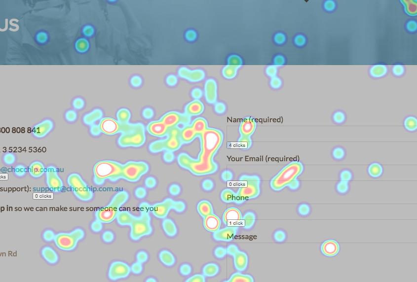
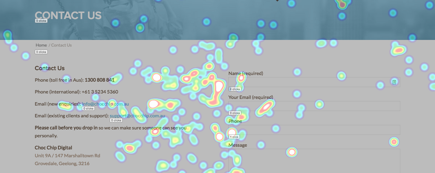
When you manage to get the site loading quickly, and have captured enough of the visitor’s attention to keep them browsing around, it’s time to figure out what they’re doing on your site, the paths they’re traveling through, and how long they’re spending on each page.
By using click trackers and heat maps, you’ll be amazed at what really goes on behind the scenes, when a visitor is working their way through your site. Take this data and start working to get your most critical content into the “hot” positions on your pages, and watch your overall conversion rates increase.
Content is the new architecture.
Websites got away with using landing pages alone, in years past. From their homepages, to the pages used to showcase their products and services, designers figured out that bare minimum content was enough to get by. The internet is evolving again, though.
Revisiting a user’s attention span, it takes more content these days to get a visitor interested in what you’re offering, where, before, you could simply get a landing page with a couple hundred words of compelling copywriting to convert them into a sale.
Blogging is taking over in 2016, even for large corporations. Businesses of all sizes are realizing the benefits of providing longer, more engaging content to their readers, and are relying on enticing headlines to get the visitors to stop clicking around on their favorite sites, and get them to move over to their own website.
Think about the advertisements that you see these days. When was the last time you saw an ad that took the user straight to a product’s landing page, and then only contained 100-200 words of copywriting? Chances are, not that many.
Nowadays, you need to work on funneling the visitor through longer content that gets their mind off of being sold to, and then use the same content to funnel the visitors onto your sales page. If the visitor gets a hint of being sold, they’re going to hit the back button, or go back to what they were doing before they landed on your site in the first place.
Touch first designs are becoming more popular.
You probably already know (or at least, should know) that responsive designs are a requirement in 2016. You can’t just get away with having a desktop version and a separate mobile version of your site. They need to be one, in the same.
Likewise, even desktops and laptops are following suit with mobile devices, and becoming touch screen. As the internet’s population gets lazier, and lazier, you’re going to have to work harder, and harder to keep their attention focused on your site.
One great way to do that is by implementing those touch focused design elements into your layouts across the board.
There are really no downsides to having flat buttons and other elements that come natural to touch users, because desktop users can still click a mouse and the same urge to click carries over from their mobile devices.
In other words, the same types of designs and layouts that work great for smartphones and tablets also work great for desktops — even as they become more touch focused. If your website is easy to browse around on using a small screened smartphone, it’s going to be just as easy to navigate on a desktop computer.
That means you can write off creating designs solely for desktop computers, instead focusing on smaller screens, and then include responsive elements that also look good when they’re scaled up on a desktop computer.
Incorporating customer data to increase user experience.
Implementing heat maps into your custom designs is something that you should already be doing, and something that large advertising agencies picked up on long ago. The heatmaps and click tracking that were mentioned previously in this article are precisely the type of information that you need to be tracking.
Instead of using it to test the efficacy of your advertising, though, you need to use them to figure out what visitors are doing on the internet, when they land onto a site, so that you can begin creating designs that are focused on getting the most important functionality into these “hot spots”.
On a separate not, it can also tell you where you are potentially losing out on visitors. For instance, if you implement the tracking and notice that visitors are scrolling halfway through the page, you can begin to address any issues that may be happening around that area.
Most times, changing up the page copy, adding in the next step for your visitor, or even figuring out what the next logical step for them may be will not only increase their usability, but also increase the amount of conversions you’re able to make on the same design — without feeling left in the dark about where visitors are dropping off.
Large brands and advertising agencies have used heat maps and click tracking for years. Now, designers are finally starting to figure out the power of the technology, and using it to help them create better designs that focus more on usability and functionality and, more importantly, reducing your bounce rate, rather than just looking good.
Card layouts, Hero images, and Rich animations.
We’ve already told you that getting your visitor’s attention while they’re on a mobile device is next to impossible these days, but there are a few design elements that you can implement to help you make sure they don’t hit the back button too quickly.
Card layouts, “hero” images, and rich animations all help keep your visitor’s attention, while not weighing down your site too much, or causing it to load slowly.
Card layouts are designs like Netflix and Pinterest use. They lay out multiple cards for visitors to browse through, and continually load more as the user scrolls further, and further down the page. These cards are also database driven (in most cases) and are designed to load more cards that are similar to what the user has already clicked, and prefers to see.
Think about your Netflix dashboard and how they automatically deliver shows and movies that are related to the shows and movies you’ve previously watched. That means, as a designer, it’s time to start learning how to control the database to start displaying the most relevant content to your visitors, based on their past browsing patterns.
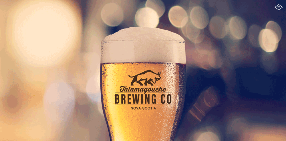
“Hero” images are the large images that take up the entire section “above the fold” and depict the company, brand, or website in a shining light. For example, check out the image below by Tatabrew (http://tatabrew.com/). It displays the company’s image front and center, and requires that you scroll down to get to the actual content. This has a huge impact on grabbing your visitor’s attention as quickly as possible.

The last design element that can get your user to stop what they’re doing and take notice are rich animations. Much like a hero image, these animations occur when a user clicks on something, or runs their mouse over an element in your design.
Most commonly, rich animations are used to bring in pop under forms that allow the users to subscribe via email. They’re also commonly used in navigation menus, background images, and slideshows.
Getting micro-commitments and interactions from the user.
In the age of mobile, getting your visitors to make “micro-commitments” to your website is the first step in getting them to convert into a subscriber, or a larger financial transaction down the road.
Funneling visitors down the path you want to take them is becoming more critical, and requires a bit more creativity than simply stating “click here”.
Nowadays, you have to use the headlines in your content, and then expand on the headlines with extensive content marketing to ensure that visitors are going where you want them to, when you want them to.
In times past, this was left up to the copywriters, but it is falling more and more on the designers desk to get the visitors taking smaller steps that add up to a bigger “yes” down the road.
As the visuals and layout of the design are being pulled up on smaller screens, the actual real estate available to work with is quickly diminishing.
That means you’ve got to prioritize the design elements that you want to showcase at the top of the screen, and then move further down into the less-than-priority elements as the user scrolls.
Getting this right requires a fine balance between design and content still, but going into the future it’s going to fall more on the designer’s hands to get this area right so that the copywriter has a good platform to start working with.
Flat, responsive designs are here to stay.
3D images and highlight text look great on desktop devices, but with the wide array of mobile devices available, it’s practically impossible to optimize your design for every single screen.
That means designers can finally get away with being lazy, and implementing more “flat” elements into their templates. It also means that the newer templates will continue to load faster, and faster, and remain compatible as new devices with varying screen sizes continue to roll out.
Designers realized the quick loading, flat, responsive designs are a hit with mobile users. Taking it one step further, “parallax” scrolling has made it even easier to keep lengthy pages loading as fast as possible.
Unfamiliar with what “parallax” scrolling actually is? Take a look at this link on fracking. They are a prime example of how to properly pull off the infinite scroll, and combine it with the rich animations mentioned above.
Now, the design we just linked to is a pretty in-depth example of what flat designs are (no 3D images) coupled with parallax scrolling, so even if your skills aren’t quite to that level, it gives you a bar that’s just been set that you should start working towards.
Customer research and feedback plays a bigger role than ever.
When was the last time you got live feedback from actual users of the designs you’ve implemented?
If you’re like most other designers, you slap together a bunch of code, make sure it works across multiple devices, that the code is clean, and then you set it up on a server for your client to take control.
This is a huge mistake, though, because real world usage research and feedback from visitors that are going to be navigating around the site on a regular basis is critical to not only make sure what you’re building actually works, but helping you learn and grow as a designer into the future.
Designers and clients aren’t the users of sites, so a truly functional design requires customer input and the use of tracking data to properly pull off. Big brands do it, so why aren’t you?
The next time you’re putting a design together for a client, send some traffic to it and install a live chat box in the lower corner that pops up as a user scrolls. Ask them directly for feedback on the usability of the site, and what they think could be improved.
Keep in mind, though, these are customers — not your fellow designers.
You’re going to get all sorts of off-the-wall answers, but every now and then you will find a diamond in the rough that gives you a solid avenue to approach, in terms of improving the design, functionality, and usability.
It will also get you in the head of the visitors who use your designs every day, and get you out of the designer state of mind.
Branding and typography are more important than ever.
With flat designs allowing less design elements to help stand out, the overall branding strategy and typography are becoming more important. Building a memorable design that’s still functional is a hurdle designers are trying to overcome in 2016.
Your branding includes quite a few different aspects, and is going to vary from client to client, and design to design.
The colors that the client chooses, the type and style of logo they display front and center, the typography chosen, whether there are videos on the page, or if it’s a page selling products, everything pulls together to give the user an overall experience.
Taking it one step further, this branding experience is going to have to work with multiple different platforms, from social media, to display ads, and email marketing.
That means it’s even tougher for you, as a designer, to give a consistent look and feel that’s going to work for your clients, for their customers, and be compatible on various platforms — not to mention devices.
Source: Matcha Ocha
How to stay ahead of the design curve going into 2016, and beyond.
Some trends have come and gone, while others are going to be around for years to come. If you want to step up your game as a designer, here’s the areas you need to be focusing on going into 2016:
- Photoshop and image heavy designs are becoming a thing of the past.
- Figure out how your visitors are spending their time on the site, then design around it.
- Keep your content front, and center, and use it to funnel visitors where you want them to go.
- Think about your touch-enabled visitors, because they’re becoming priority #1.
- Incorporate customer feedback and research into your designs to increase user experience.
- Use database driven card layouts, hero images, and rich animations to grab the visitor’s attention.
- Get “micro-commitments” from your visitors to lead them closer to a sale down the road.
- Flat, responsive designs aren’t going anywhere, anytime soon.
- Both customer, and client feedback will help you grow as a designer going into 2016.
- Branding and typography are more important than ever, and need to remain consistent.
If you’re ignoring any of these areas, you’re going to get left behind by the competition and the big brands who are spending millions of dollars every year on developing their websites.

