Watch Me First!
Learn how heat maps can help you understand your website’s activity
Google Analytics is amazing, don’t get me wrong, but it’s also CRAZY COMPLICATED. For a lot of people Google Analytics represents a learning gap that’s not worth the time or effort to invest in.
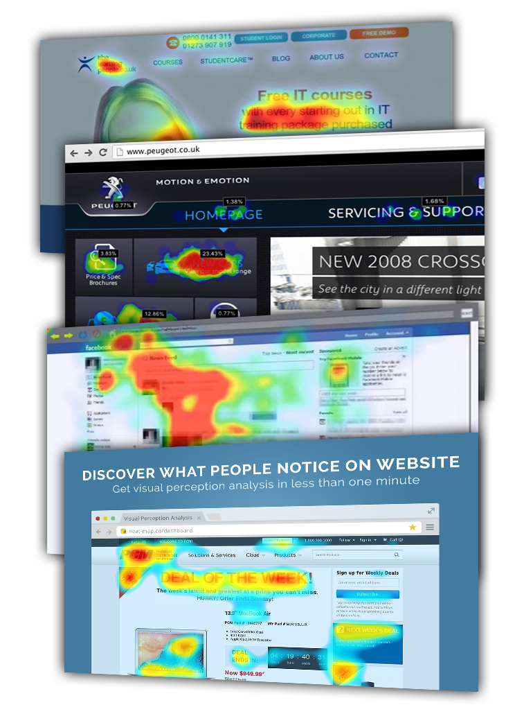
For those of us who want a simple reporting solution what are the options? Heat Maps are a great way to get a simple breakdown of your website activity; tracking mouse hovers, clicks and scrolls. Elements on your page which receive a lot of attention are coloured red, whereas areas of indifference are marked in blue.
A heat map will very quickly tell you how your page is performing, and what people like and don’t like. It’s like viewing an instant score card.
There are a bunch of free heat map tools on the market like Zoho PageSense, Mocking Fish, User Heat to name just a few.
If you want help with setting up a heat map or have general questions about website reporting let us know!
Want to discuss how you can improve your online presence? Take action now and get in touch with us!
either call us or fill out the contact form online


